DELTA PRICING: SAPPHIRE
BACKGROUND
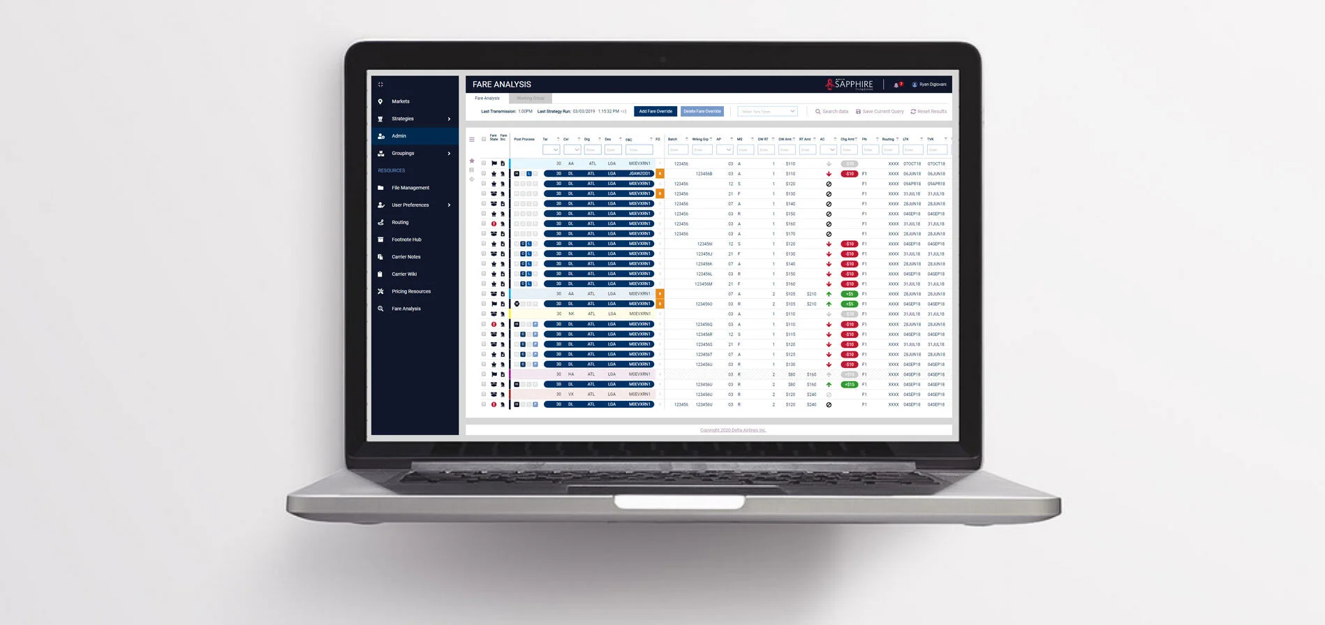
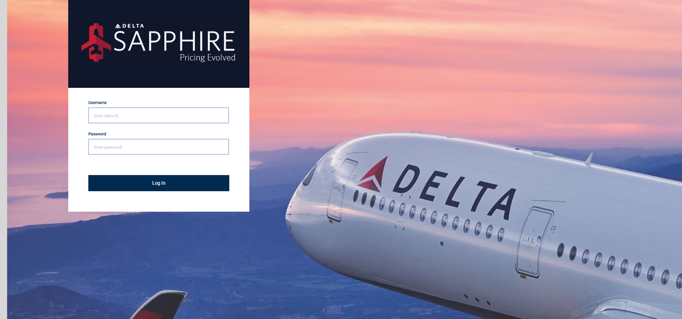
Delta is the leader in the multi-billion airline industry. Delta leads the way in creating innovative products geared towards the future. Sapphire is one of those innovative products. Sapphire is a revenue management web application for market, strategy and retail analysts to manage and strategize fares in specific markets.
PRODUCT
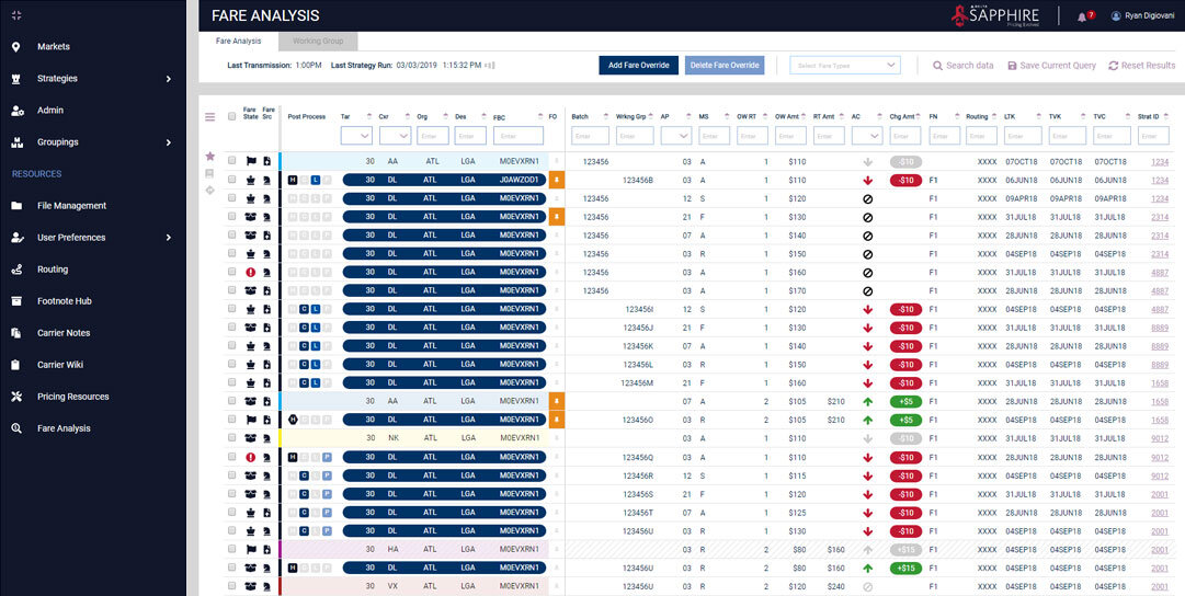
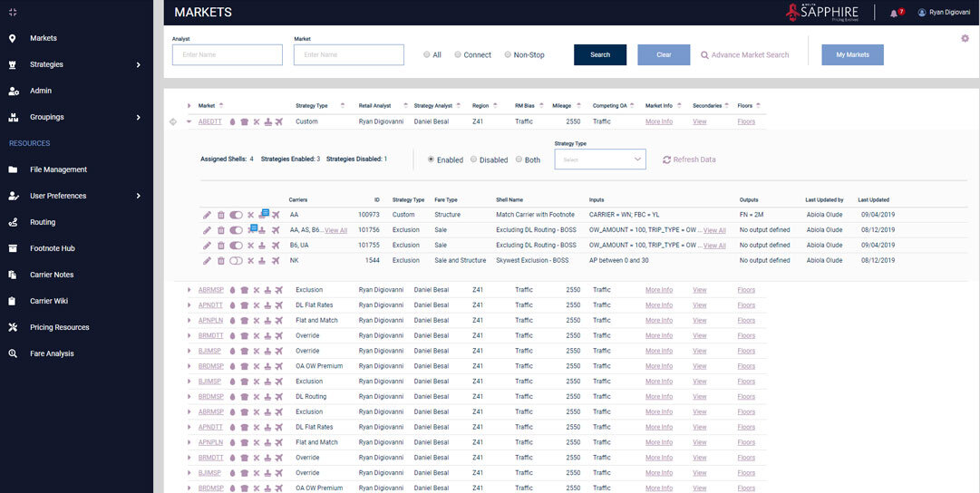
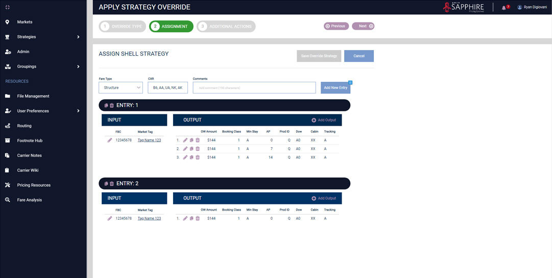
Delta is revamping internal applications to manage fares and competitive analysis. Sapphire’s purpose is to automate processes for analysts to make quicker analysis of markets and their competitors. Sapphire offers flexibility for analysts to apply custom strategies to meet business specific goals.
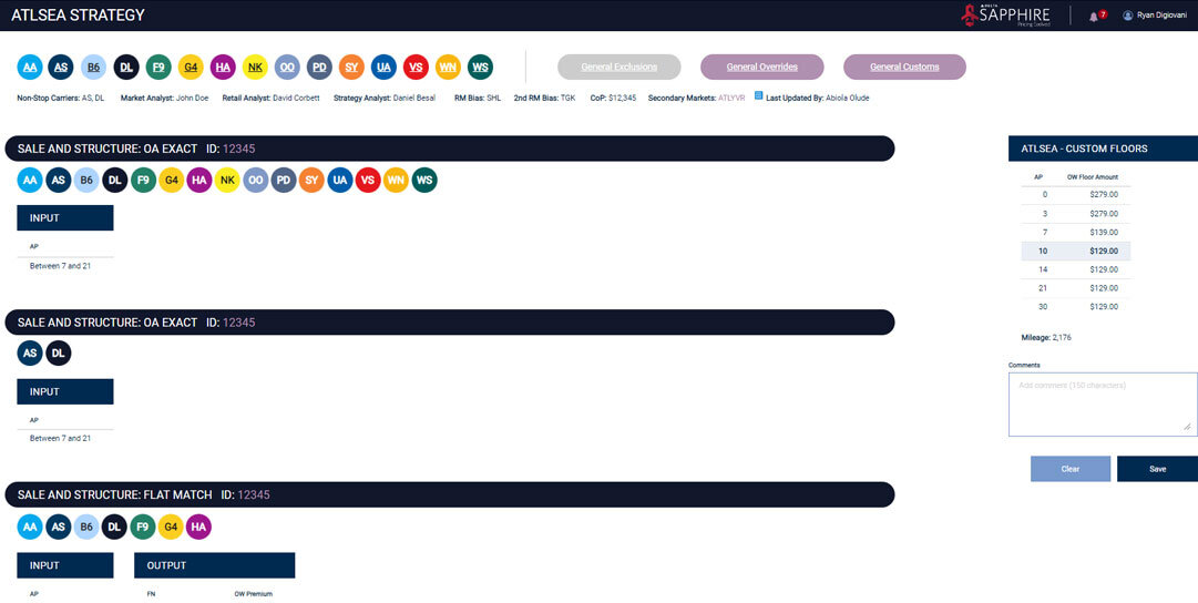
Carriers analyzed with Sapphire.
ROLE
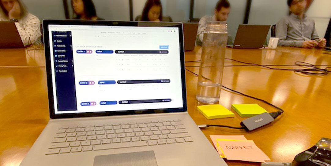
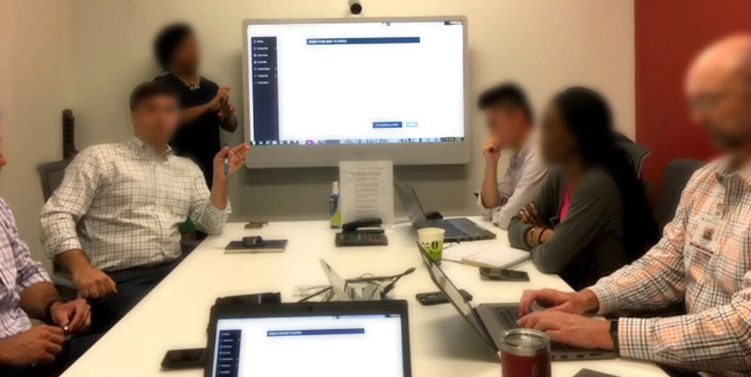
I work in an agile environment in two week sprints. Meet daily with the director of product, product owner, tech product owner, business analyst, scrum master and team of developers to review and give statuses of committed stories. Lead design sessions twice a week with product manager, product owner, market analysts, retail analysts and carrier analysts to review and test wireframes. Iterate quickly off the feedback. Organize and gather information for product features. Build low and high fidelity wire frames, user flows, information architecture. Create functioning prototypes. Hand off designs to development. Build and implement Sapphire style guide. Write and update user stories in VersionOne. Present wireframes to executive stakeholders and scrum team in refinement sessions.
ROLE: UX/UI Designer; User Researcher
TOOLS: Axure, Figma, Adobe Illustrator, VersionOne
TEAM: Director of Product, Product Owner, Tech Product Owner, Business Analyst, Front and Back-End Developers
IDENTITY
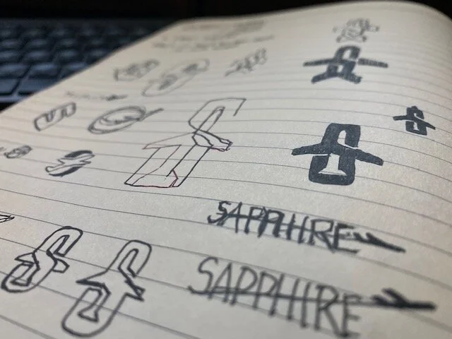
I proposed designing a logo for the Sapphire application and created numerous concepts before landing on the final concept. The Sapphire logo is created to reflect the Delta brand but to also carry its own identity. In this smart design are the three pillars of Sapphire - airline industry, revenue and strategy which are all reflected in the logo. It was highly received and differentiated Sapphire from other Delta products.
STYLEGUIDE
I seized the opportunity to create visual guidelines for Sapphire. I approached this first by talking with the marketing department and obtaining Delta's official brand styleguide. I worked within in the constraints of Delta's corporate brand to deliver end to end stabilization of visuals.
PALETTE
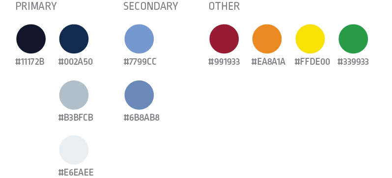
I simplified the number of colors used in Sapphire and strategically included competitors branded colors for quick identification throughout application.
TYPOGRAPHY
I made the decision to only use the Roboto family for its readability, scability and simplicity.
PROCESS
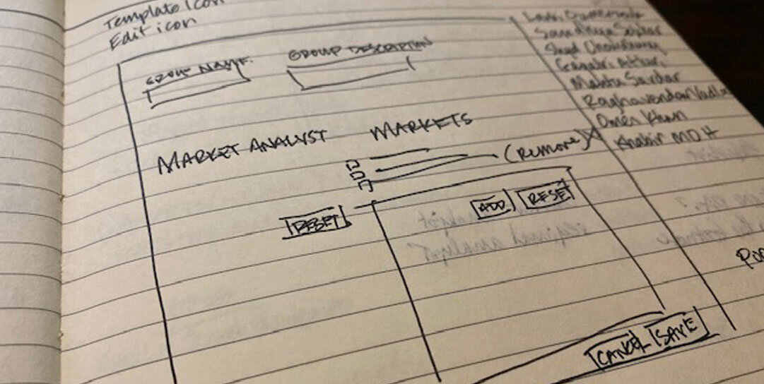
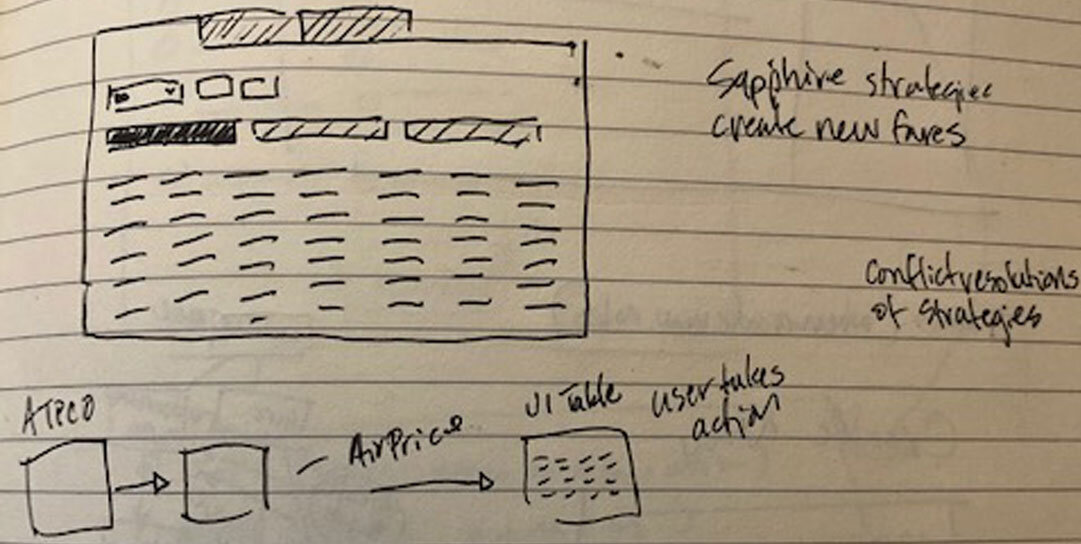
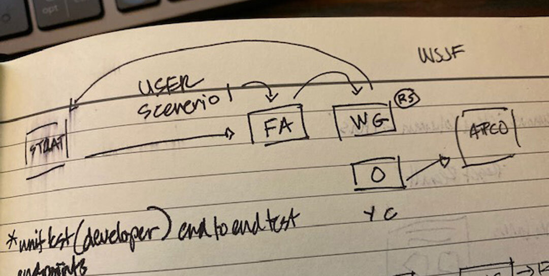
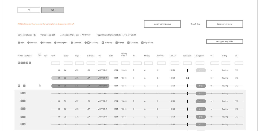
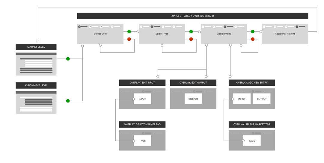
Sapphire has many layers with numerous features to perform unique tasks. I used several methodologies of UX and research to organize information, develop user flows, create wireframes, and iterate off of feedback. Here are samples:
PERSONAS
EMPATHY MAPPING
SITE MAP
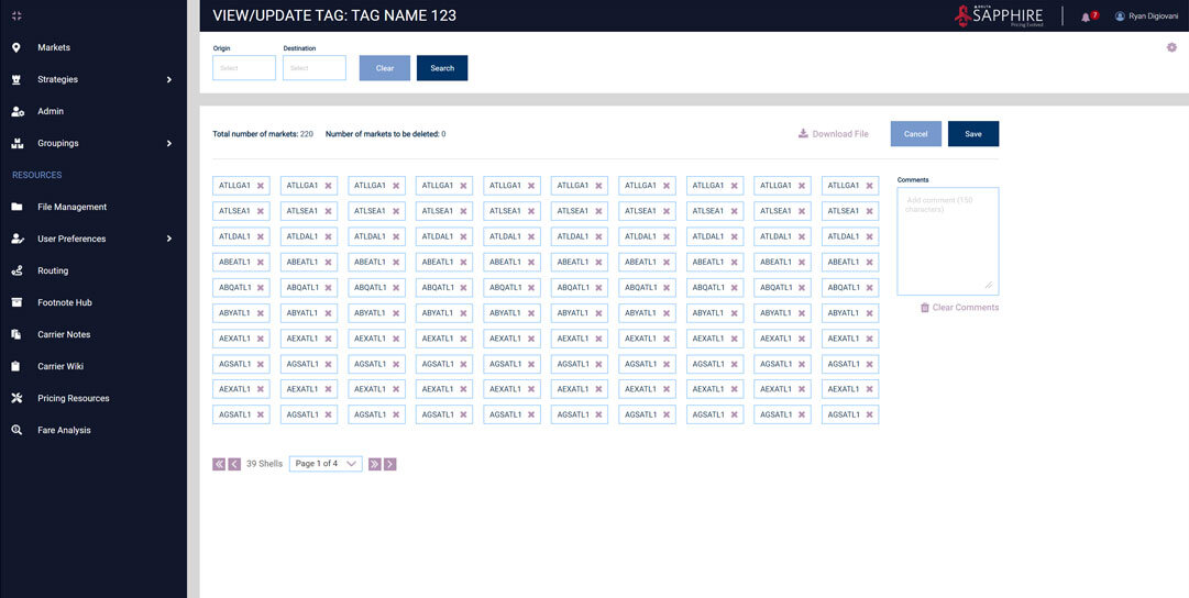
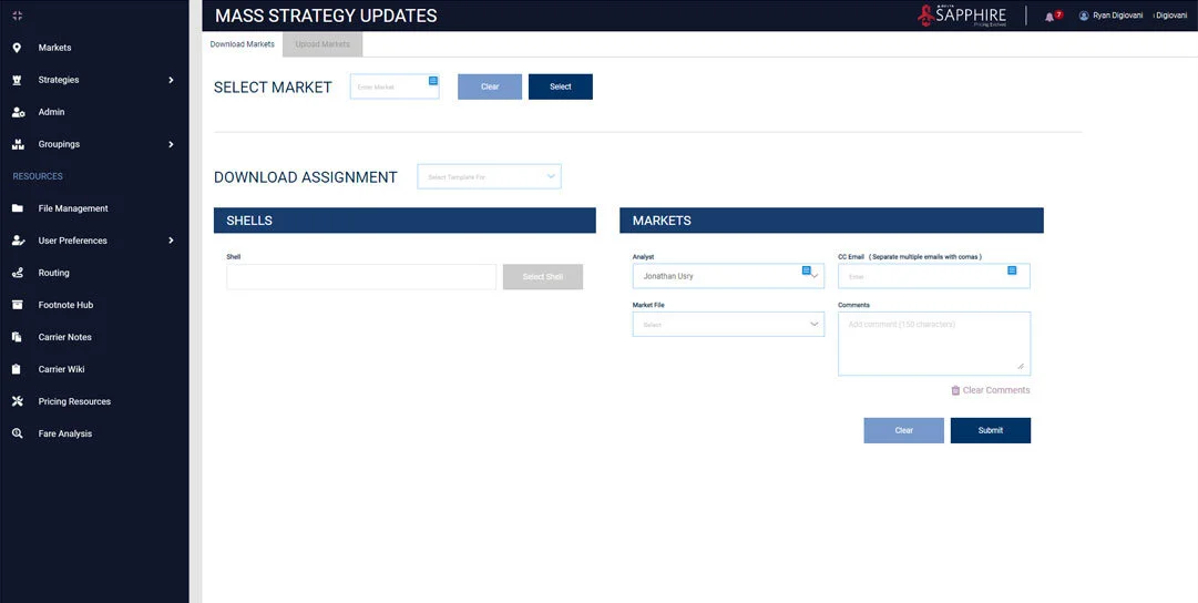
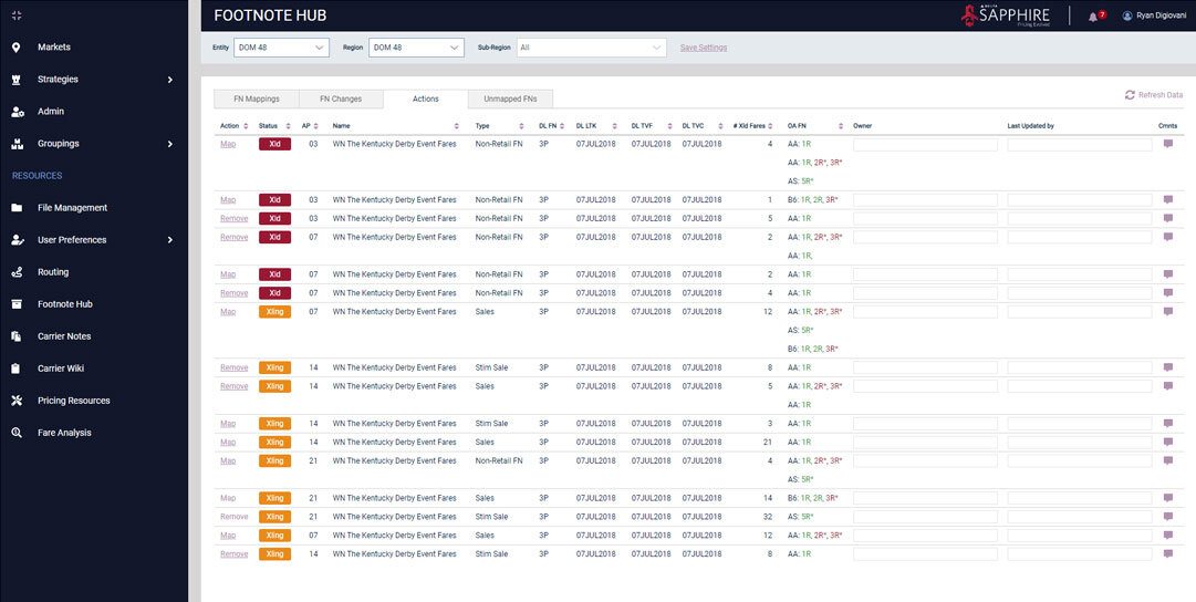
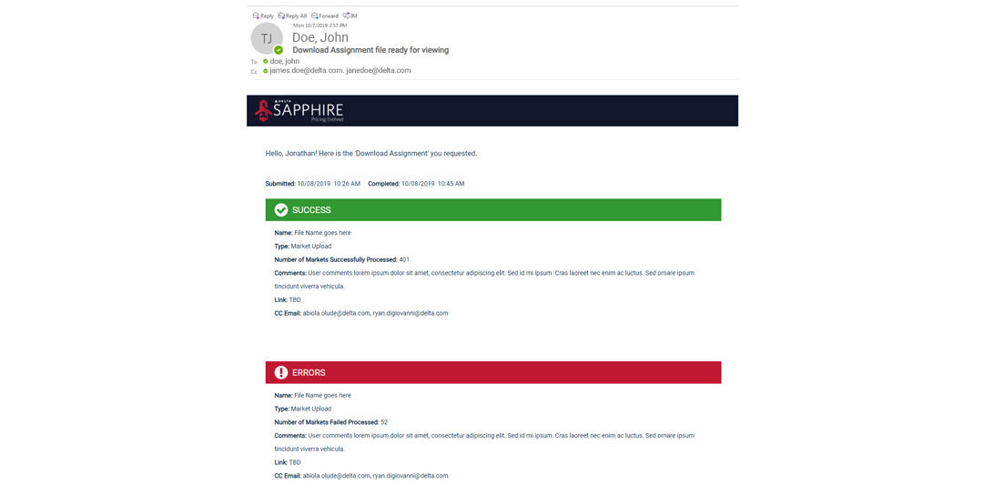
PROTOTYPE
Sapphire appeals to several user roles by applying smart interactions, simple color palettes and a clean layout. Feedback from users and stakeholders is high.
